Currently: leading the SEP website redesign

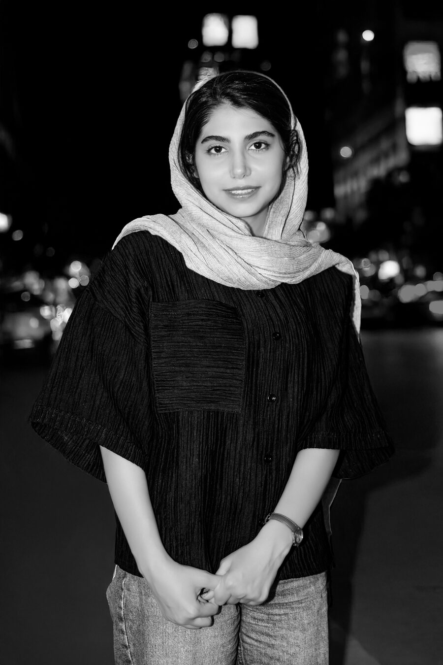
Hi, I'm Mahshad — I design interfaces for people, not manuals.

UI/UX designer with a graphic design background, working across fintech and e‑commerce — research, design systems, and high‑fidelity UI for RTL/Persian products.

Mahshad Hosseini Mehr
say hi 👋

Selected Work

Things I've made

A few projects, a few different problems — tap any to read more.

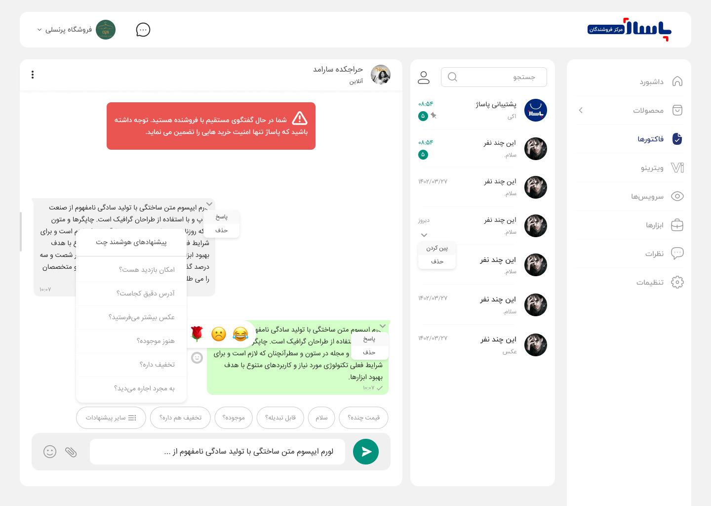
Owned the full buyer and seller experience for an e‑commerce marketplace, across both web and mobile. Three decisions from that work, in their own words:

Decision 1 — The desktop nobody built for

It started with a simple piece of feedback: sellers were calling daily because they couldn't list products on desktop — the seller panel had only ever been built for mobile. I redesigned the desktop version to align with mobile, then split the product‑add form into separate cards by information type, so sellers could focus on one thing at a time. Calls slowed down over time — and one seller even called back just to say thank you.

Decision 2 — A chat that didn't need an instruction manual

The employer wanted the existing buyer‑seller chat expanded — product sharing, discount codes, price negotiation, reactions, canned replies — without it turning cluttered. Since Passazh's users spanned such a wide slice of Iranian society, I based the design on WhatsApp's familiar UI: message bubbles, read receipts, the contact‑list‑plus‑chat layout. That familiar skeleton let the more complex features sit on top without anyone feeling lost.

Decision 3 — The cart that remembered

Buyers kept losing track of products they'd removed from their cart when they weren't ready to buy yet. So I designed a second cart — a holding space for items instead of deleting them outright.
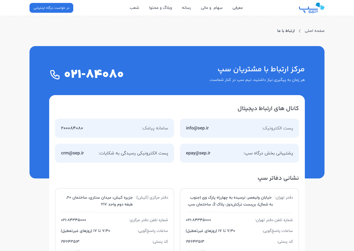
When I delivered the first redesign, the team lead rejected it — and the initial feedback wasn't very clear either. After a few conversations, I understood the issue came from two places: too many colors had blurred the brand's formal identity, and the visual hierarchy wasn't right. I'd also built a constraint in my own head — assuming I wasn't allowed to move sections because of SEO — which turned out not to be true. The first version leaned on Iranian websites as reference; the team lead suggested looking at international payment websites instead, which genuinely helped. I'm currently working on the second version.

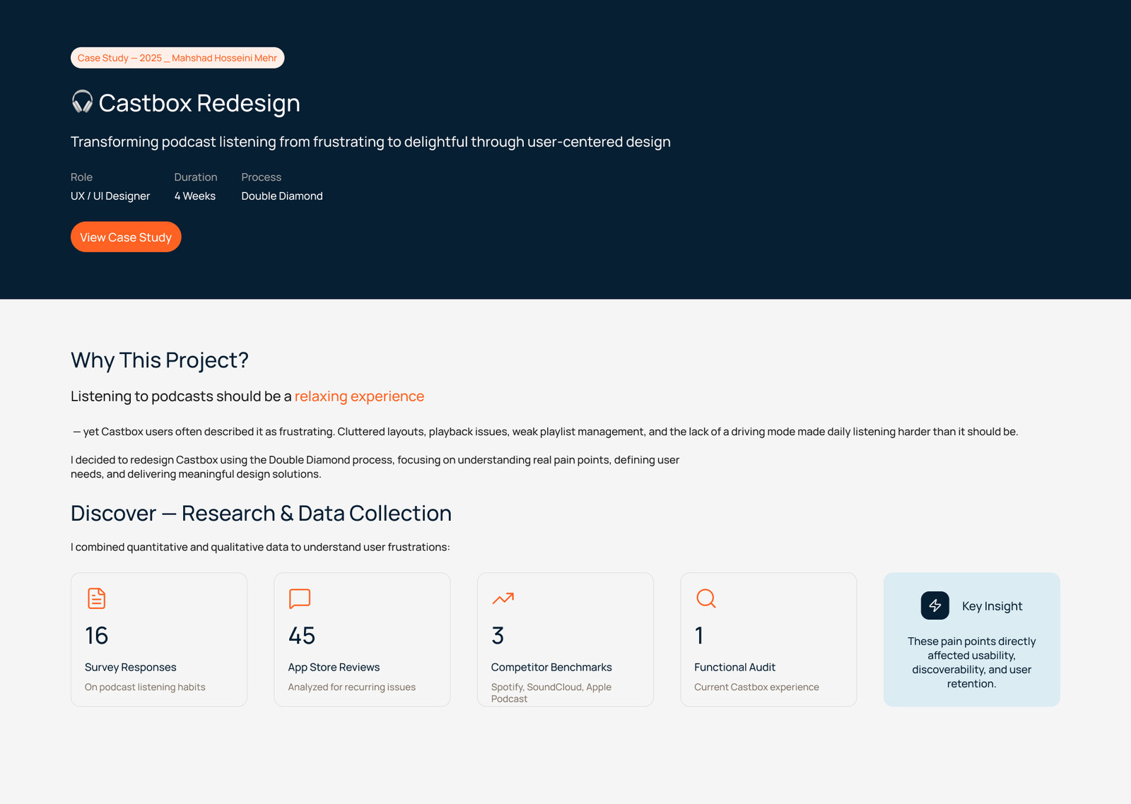
Redesigned key flows to improve navigation and content discoverability through design‑thinking research and UI refinement. Completed as a class assignment.

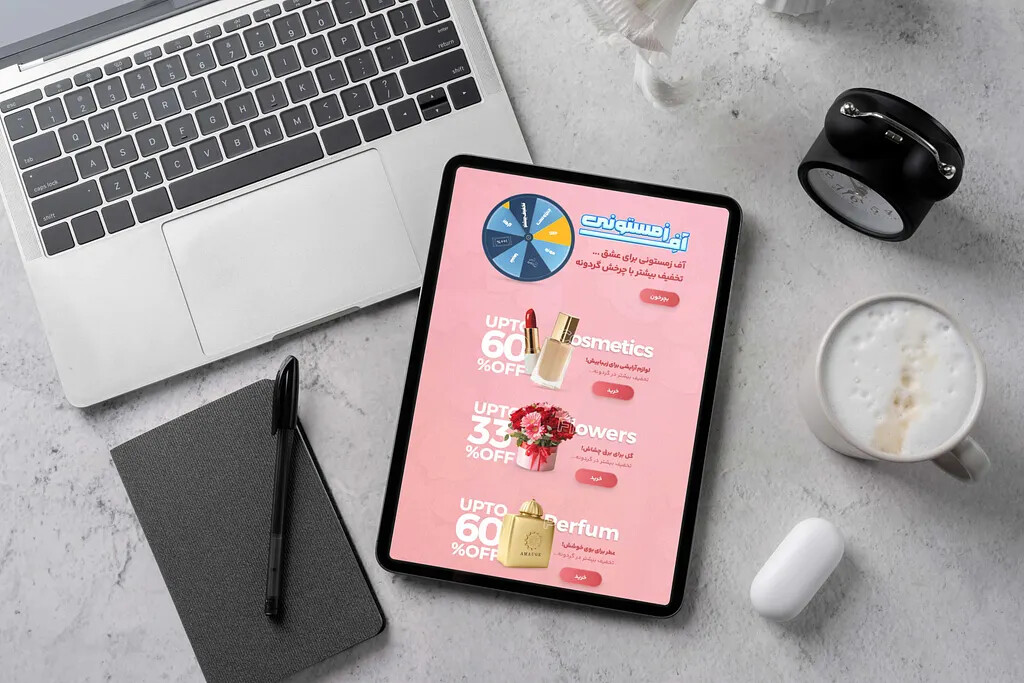
We were mid‑production on a winter campaign with a blue, snowy theme when marketing asked for a shift to Valentine's — with only one day left. I kept the spin‑wheel graphic and logotype so users wouldn't feel lost, and just moved the background toward pink and love‑themed symbols. That kept the one‑day deadline realistic while preserving the campaign's visual continuity.

Other work

The challenge here was more about forms than routes: passengers entered their origin, details, and even the request date/time across separate modals. But the real friction between me and the client was the trip‑details page. The client kept insisting it carried a lot of value, but never gave clear feedback on what to change. I designed several versions and got the same vague reaction each time — even I couldn't quite pin down the problem. I later learned the whole project had been cancelled.

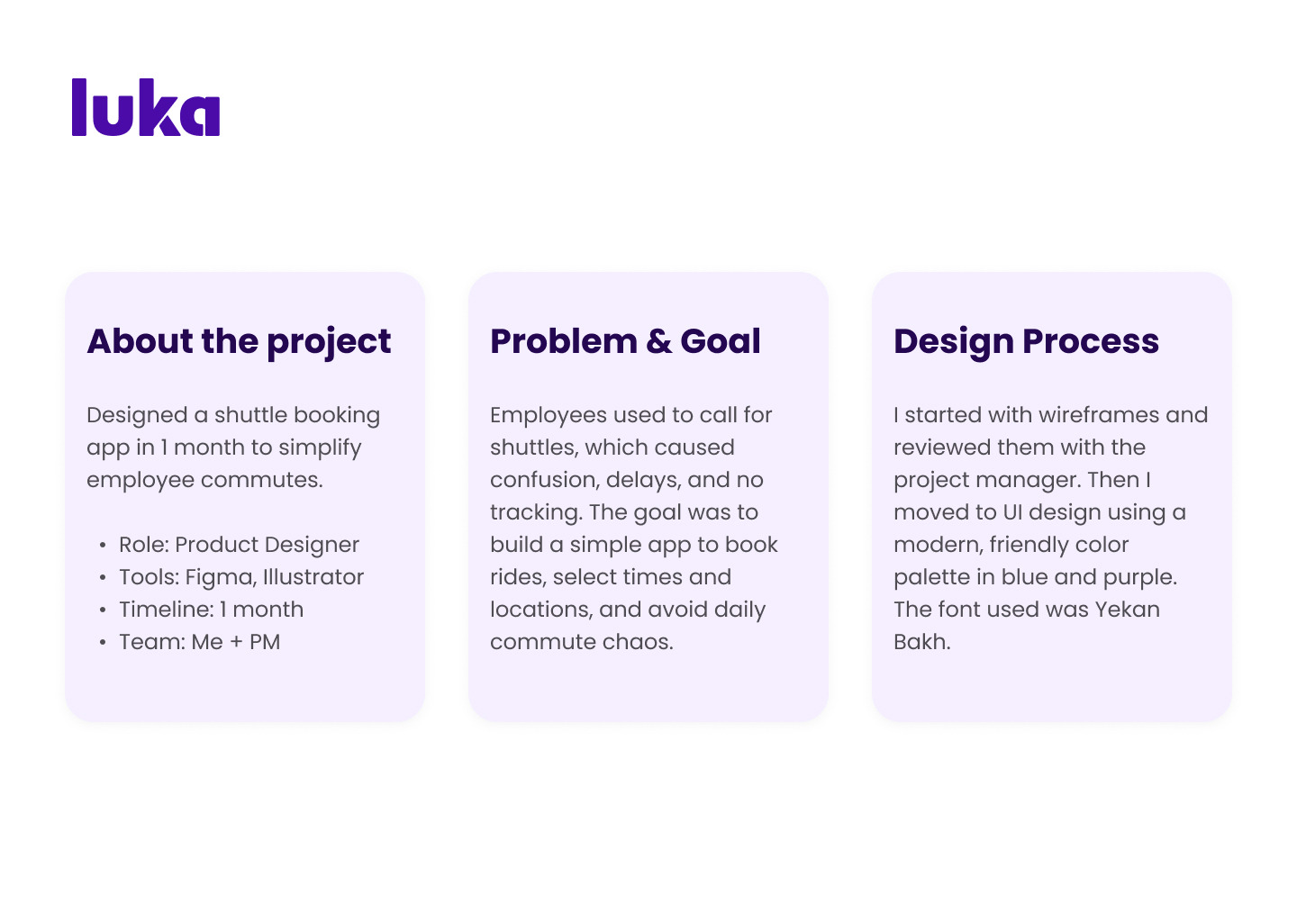
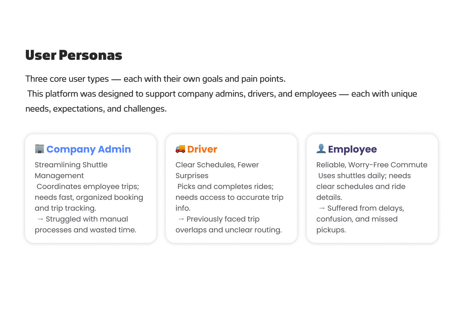
Designed from scratch across three platforms: a desktop admin panel for companies (heavy data entry), a driver app for selecting routes with map details, and an employee app showing pickup driver and timing. Used a distinct primary color per platform — light blue for the company panel, orange for the driver app, indigo‑purple for the employee app — so each persona could instantly recognize which platform they were in.

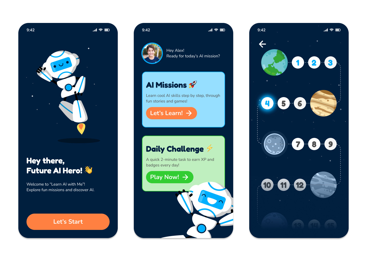
Designed for a job interview task: create a concept for an app that teaches AI to kids. I picked a mascot to convey an AI feel, used a space‑themed background to appeal to children, and chose fonts with particular care for that age group.

Research & Thinking

Notes along the way

Short write‑ups connecting cognitive science to product design.

System 1 / System 2 thinking in everyday product decisions

Notes on how Kahneman's dual‑process model shows up in the small, fast decisions users make inside an interface — and what that means for how we design defaults.

Full note — coming soon

More notes coming soon

This space will collect short essays and observations as I keep exploring the research side of design.

About

A bit about me

I started in graphic design and moved into UI/UX because I wanted to own outcomes, not just visuals. Since then I've worked across e‑commerce, fintech, and mobility products — usually picking up a feature or a page and taking it from research through to a shipped, maintained design‑system component. still learning, always

Toolkit

Skills

Tools

Figma, Photoshop, Illustrator, Adobe XD

Method

Design thinking, double diamond

Research

Personas, journey maps, usability testing

Systems

Design systems, tokens, WCAG audits

Focus

RTL / Persian interface design

Currently

Product Design — Amanj Academy

Education

Learning, always

Associate Degree in Graphic Design . B.A. in Visual Communication

Product Design — Ali Babaei

Amanj Academy · in progress

Google UX Specialization

INVERSE UI/UX

Soheil Najafi Bootcamp

Résumé

Take it with you

Industry résumé (PDF)

Updated with current role, projects, and skills.

Download

Get in touch

Let's talk

Open to product design roles and select freelance projects.